Templates / Contrast
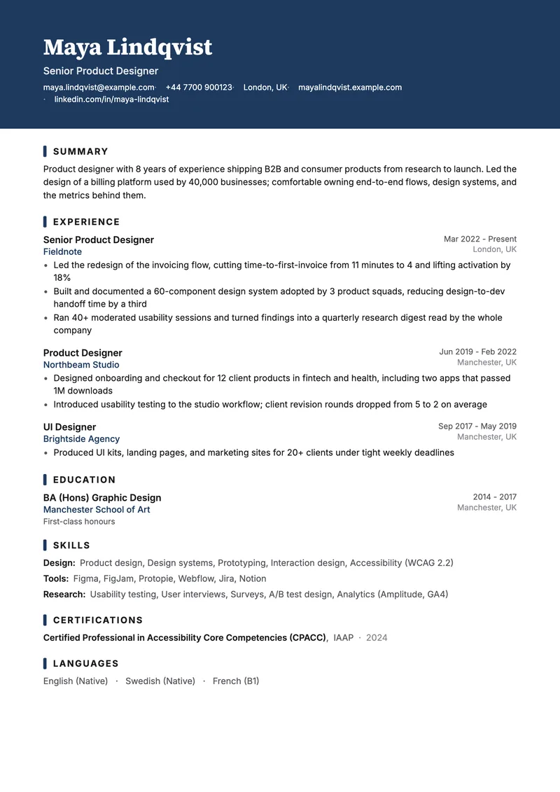
The Contrast resume template
A bold color header that makes the top of your resume unmissable
Contrast opens with a full-width band in your accent color, white name and contact on top of it, then switches to a quiet single column. You get one strong visual statement and then the content takes over. Despite the color, it stays fully ATS-safe: everything is real text.
- Full-bleed accent header with white type
- Thick accent ticks mark each section
- Everything remains selectable, parseable text
Best for: Design, marketing, product, startups, any role where a bit of personality helps.
Free means free: no account, no watermark, no paywall at the download button. Your resume stays in your browser.
One strong statement, then get out of the way
The accent band runs edge to edge. Unlike the other three templates, the page itself carries no padding in Contrast — the colored header supplies its own, which is what lets the color reach the paper's edge instead of floating in a white frame. Your name, headline and contact line sit on top of it in white, the headline at slightly reduced opacity so the name stays dominant.
Below the band, the template goes quiet: one column, standard margins, and a short thick tick in your accent color marking each section title. That is the whole design. The reason it works is the contrast in the name — a single loud element followed by a page that behaves itself, rather than color sprinkled throughout competing with your sentences.
The band takes its color from the accent you pick in the builder, so this is the template where that choice matters most. A saturated color reads as design or marketing; a deep navy or forest green reads as a conservative firm that happens to have a cover. Both are one click apart, and the rest of the page does not change.
What an applicant tracking system sees
- The colored band is a filled rectangle with text drawn on top, not an image of text — your name and email extract as characters.
- White-on-color type is still type. Parsers read the text layer and never see the color at all.
- If a specific employer's system worries you, the same content in Clean is one click away and loses only the band.
The full list of what parsers can and cannot read is on what makes a resume ATS-friendly.
When to pick a different template
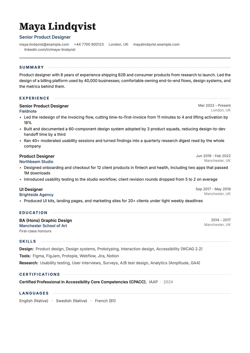
- The Clean resume template if the application is conservative and you want no color at all.
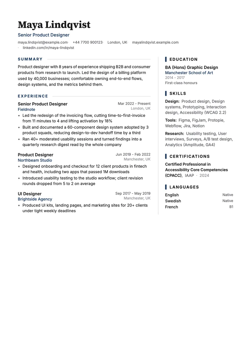
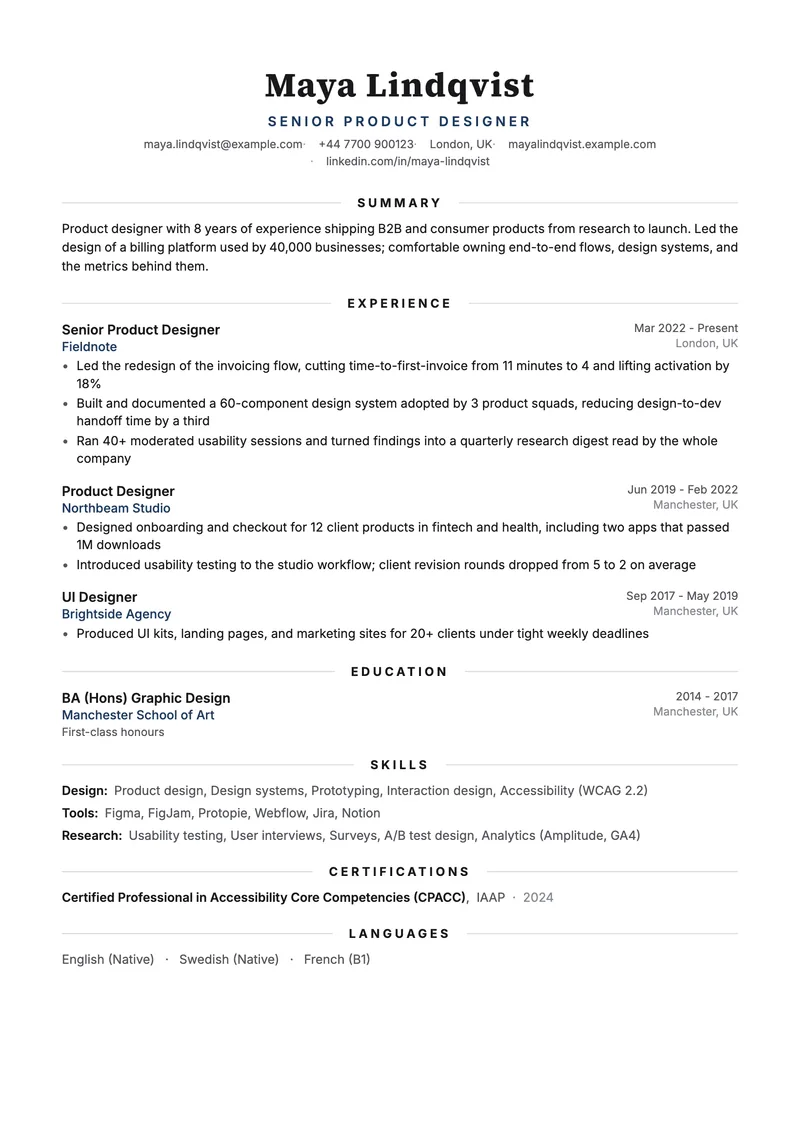
- The Executive resume template if you want presence without color, from typography instead.